The reason for choosing theft as the selected bias comes from the strong relationship between theft and poverty. Due to the attribute for crime comes from factors besides peer pressure, poverty, community behavior. Therefore, the assumption of poverty leading potential theft behavior guides my decision in selecting theft, and I also want to figure out the potential physical environment impact on the theft behavior.
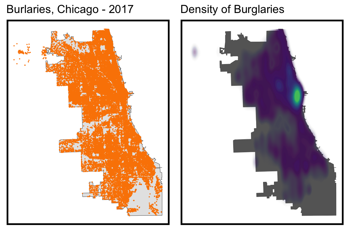
When focusing on the spatial distribution, we can find that the whole city have certain amount of crime happened, expect the south part. The density map of crime reveals the high frequency and strong intensity in the east part, especially near the river north district. The situation potentially results from the role of city central and adequate market activities in this area.
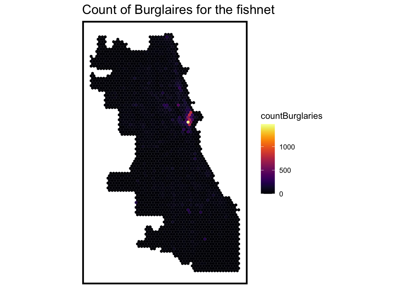
When we use fishnet to calculate the amount of theft behavior in the 500 inch grid, we can find the distributional features concentrated in the east matches the theft crime density map.
Code
crime_net <- dplyr::select(burglaries) %>%mutate(countBurglaries =1) %>%aggregate(., fishnet, sum) %>%mutate(countBurglaries =replace_na(countBurglaries, 0),uniqueID =1:n(),cvID =sample(round(nrow(fishnet) /24), size=nrow(fishnet), replace =TRUE))ggplot() +geom_sf(data = crime_net, aes(fill = countBurglaries), color =NA) +scale_fill_viridis(option ='B') +labs(title ="Count of Burglaires for the fishnet") +mapTheme()
Code
# For demo. requires updated mapview package# xx <- mapview::mapview(crime_net, zcol = "countBurglaries")# yy <- mapview::mapview(mutate(burglaries, ID = seq(1:n())))# xx + yy
Variable Selection
To make location prediction of theft, we try to figure out related spatial feature. Just shown in the ‘Broken Window’ effect, the place in bad management situation has more potential to confront worse security situation, which leads to higher possibility of theft. Therefore, we select the vacant house reported, garbage cart report, and abandoned cars 311 request data as the potential supporting spatial features of the location feature of theft.
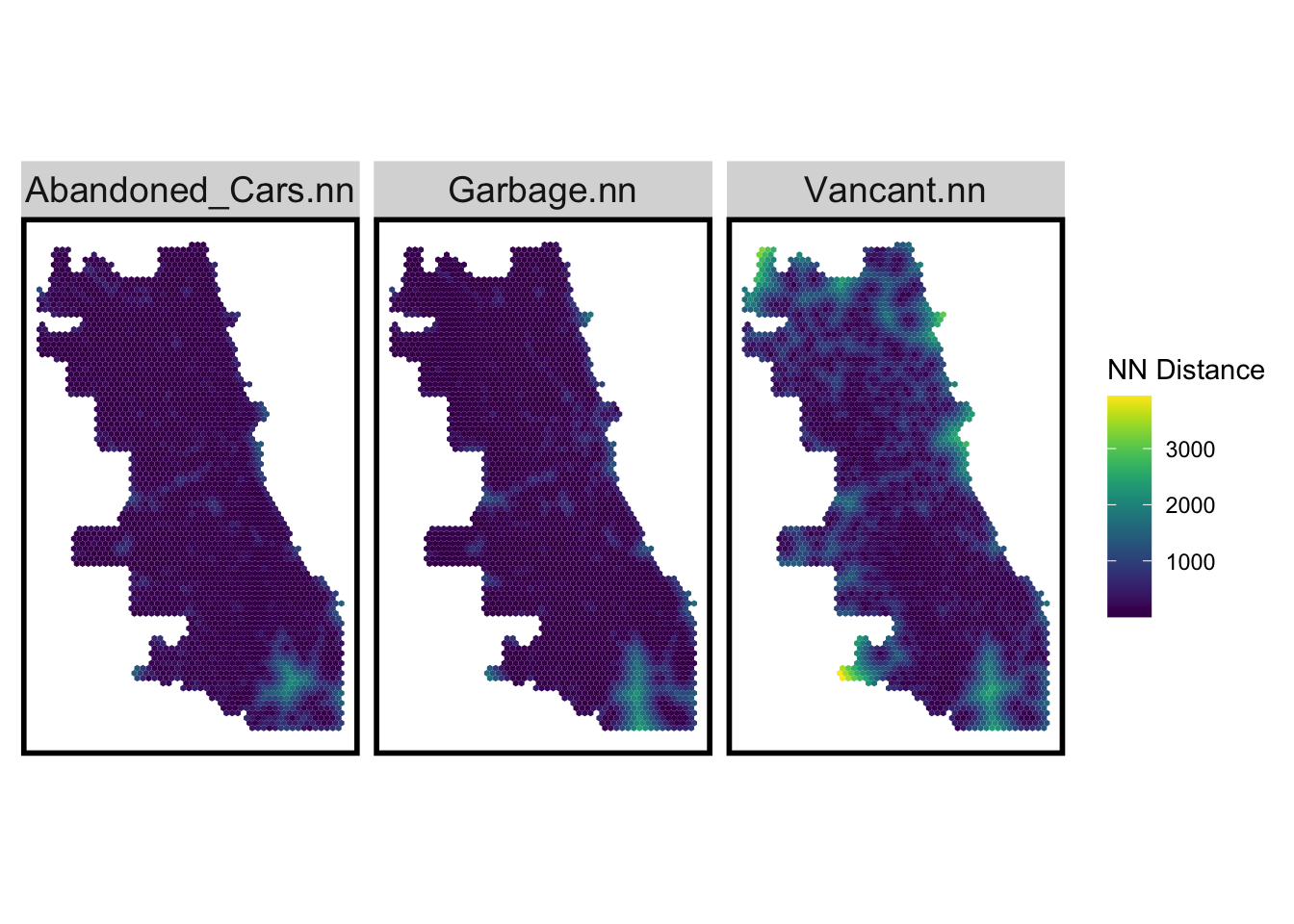
*311 Service Requests - Abandoned Vehicles The dataset records all open abandoned vehicle complaints made to 311 and all requests completed since January 1, 2011. A vehicle can be classified as abandoned if it meets one or more of the following criteria. The abandoned car illustrates the street vitality in some ways.
*311 Service Requests - Garbage Carts The dataset records all open garbage cart requests made to 311 and all requests completed since January 1, 2011. The request for Garbage carts shows the demand for street clean in the surrounding street, which potentially reveals the citizen’s attention to the quality of life.
When we focus on the distance to the nearest 311 report in the city grid, we can find that the abandoned cars and garbage carts request reveals the similar situation that the south part generally have a longer distance to the closest report. When we focus on the distance to nearest Vacancy report, the area around city boundary generally has a longer distance.
Code
## Visualize the NN featurevars_net.long.nn <- dplyr::select(vars_net, ends_with(".nn")) %>%gather(Variable, value, -geometry)ggplot() +geom_sf(data = vars_net.long.nn, aes(fill=value), colour=NA) +scale_fill_viridis(name="NN Distance") +facet_wrap(~Variable)+mapTheme()
Due to several variables taken into consideration, we try to make the considerate variable that both include the vacancy, abandoned vehicle, and garbage cart.I use weighted assignment method to combine the number of these variables as a index to calculate the comprehensive report situation.
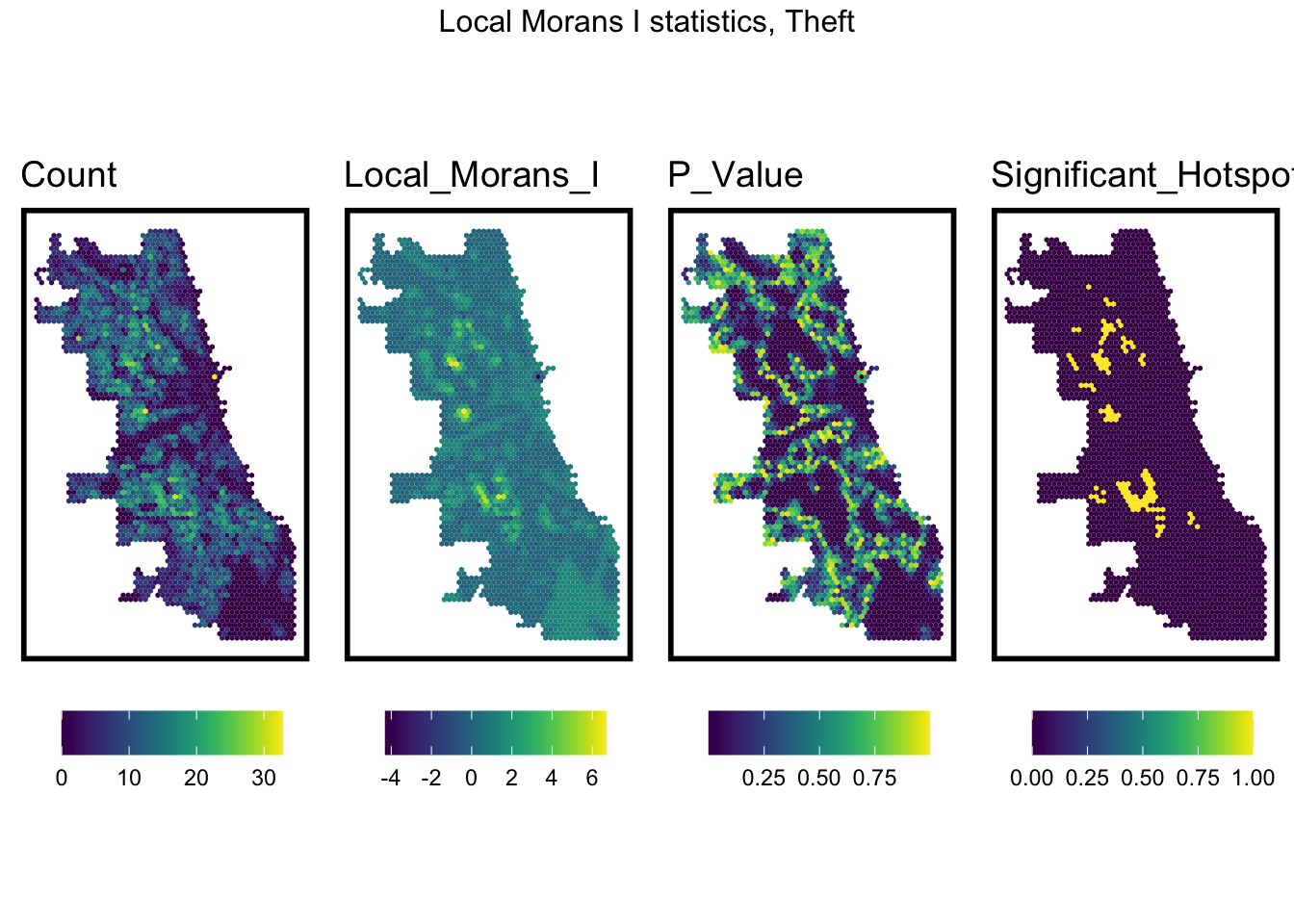
When we use Local Moran’s I test to assess the spatial autocorrelation, we can find that the the north-middle and south-middle part have a obvious higher autocorrelation, which show that locations that are close to each other tend to have similar or dissimilar attribute values. The low P-value in these area shows that the observed data is unlikely to have occurred by random chance alone. Therefore, we can assume that except these two area, this variable is statistically significant and is not exhibiting a significant spatial pattern or spatial dependence. And the further modeling in this two areas should be cautious with clustering pattern.
vars <-unique(final_net.localMorans$Variable)varList <-list()for(i in vars){ varList[[i]] <-ggplot() +geom_sf(data =filter(final_net.localMorans, Variable == i), aes(fill = Value), colour=NA) +scale_fill_viridis(name="") +labs(title=i) +mapTheme(title_size =14) +theme(legend.position="bottom")}do.call(grid.arrange,c(varList, ncol =4, top ="Local Morans I statistics, Theft"))
correlation scatterplot
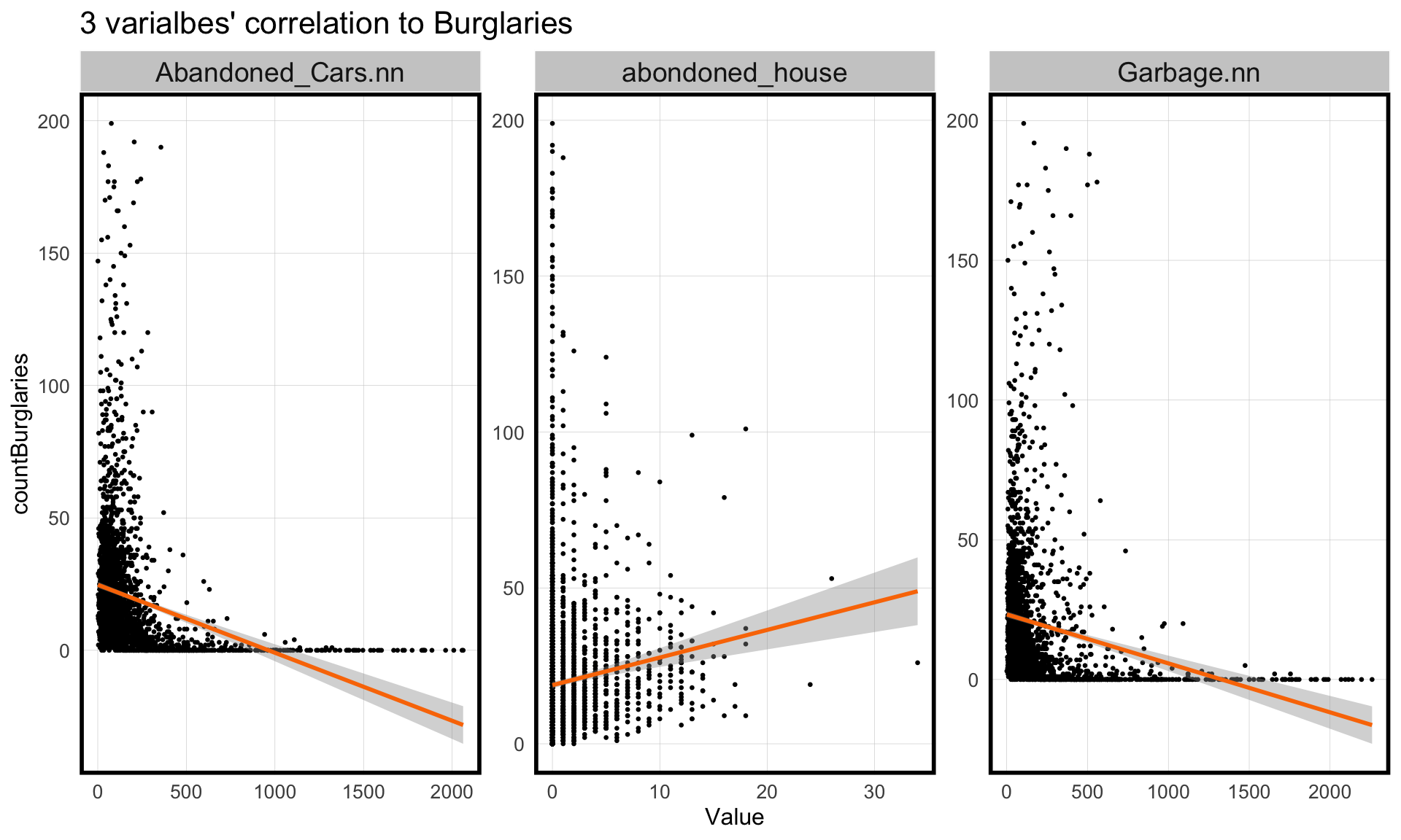
When we look at the scatterplots of the variables to the theft crime count, we can find that these variables both reveals the impact on the count of theft. the nearest distance of abandoned cars and number of garbage request illustrates the negative correlation to the count of theft. The number of abandoned house report in the grid shows a positive correlation to the number of theft. The trend matches our assumption that the area with lower attention on the street and more serious vacancy situation represents less security and more potential theft behavior.
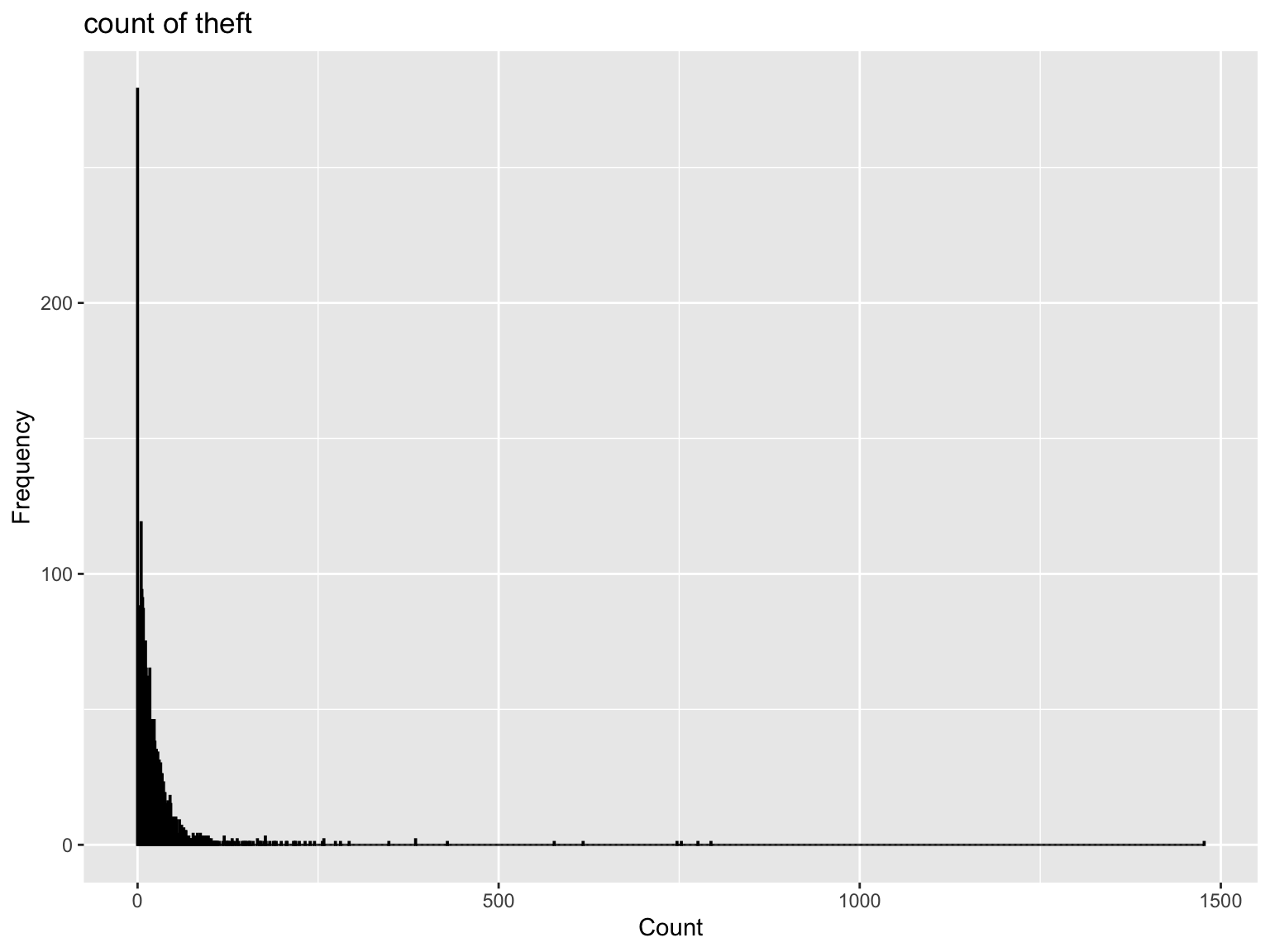
Also, the histogram of number of theft reveal nearly skewed normal distribution, which could potentially impact model’s parameter estimates, assumptions, and predictive accuracy.
Code
crime_his <-ggplot(final_net, aes(x = countBurglaries)) +geom_histogram(binwidth =1, fill ="grey", color ="black") +labs(title ="count of theft", x ="Count", y ="Frequency")crime_his
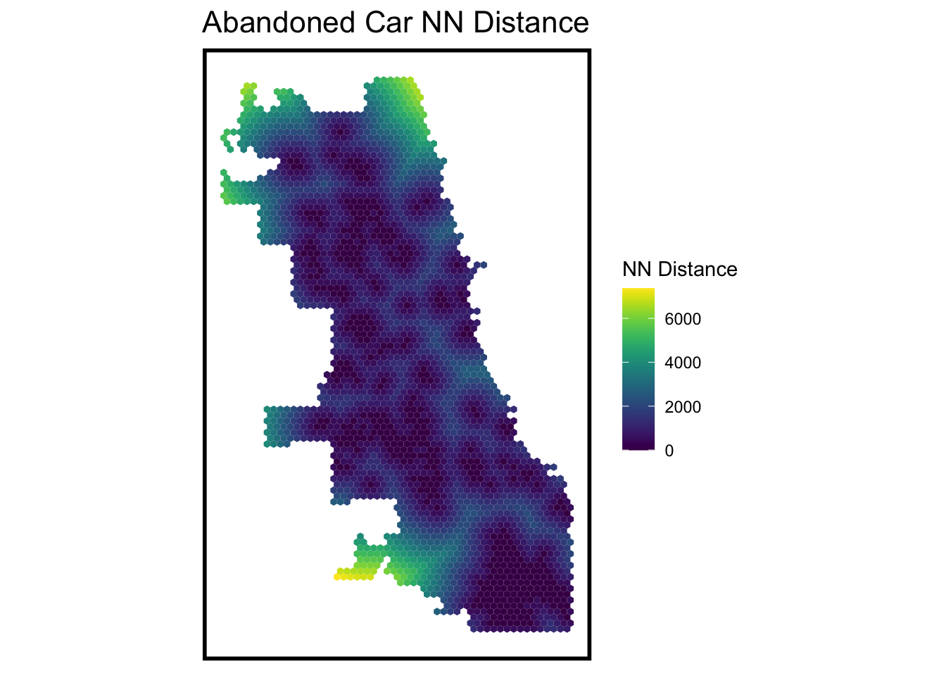
Then, we use score of Local Moran’s I as the judge of spatial dependence to check the ‘degree of reliance’ for the variable. we figure out the point with low p-value is statistically significant. And we calculate the distance to the nearest reliant point. We can find that the north and south part have a higher distance to closest reliant point, which means that the the variable is statistically significant in the Chicago in general.
Code
# generates warning from NNfinal_net <- final_net %>%mutate(abandoned.isSig =ifelse(local_morans[,5] <=0.01, 1, 0)) %>%mutate(abandoned.isSig.dist =nn_function(st_c(st_coid(final_net)),st_c(st_coid(filter(final_net, abandoned.isSig ==1))), k =1))## What does k = 1 represent?ggplot() +geom_sf(data = final_net, aes(fill=abandoned.isSig.dist), colour=NA) +scale_fill_viridis(name="NN Distance") +labs(title="Abandoned Car NN Distance") +mapTheme()
Data Modeling
Model Based on Spatial Feature
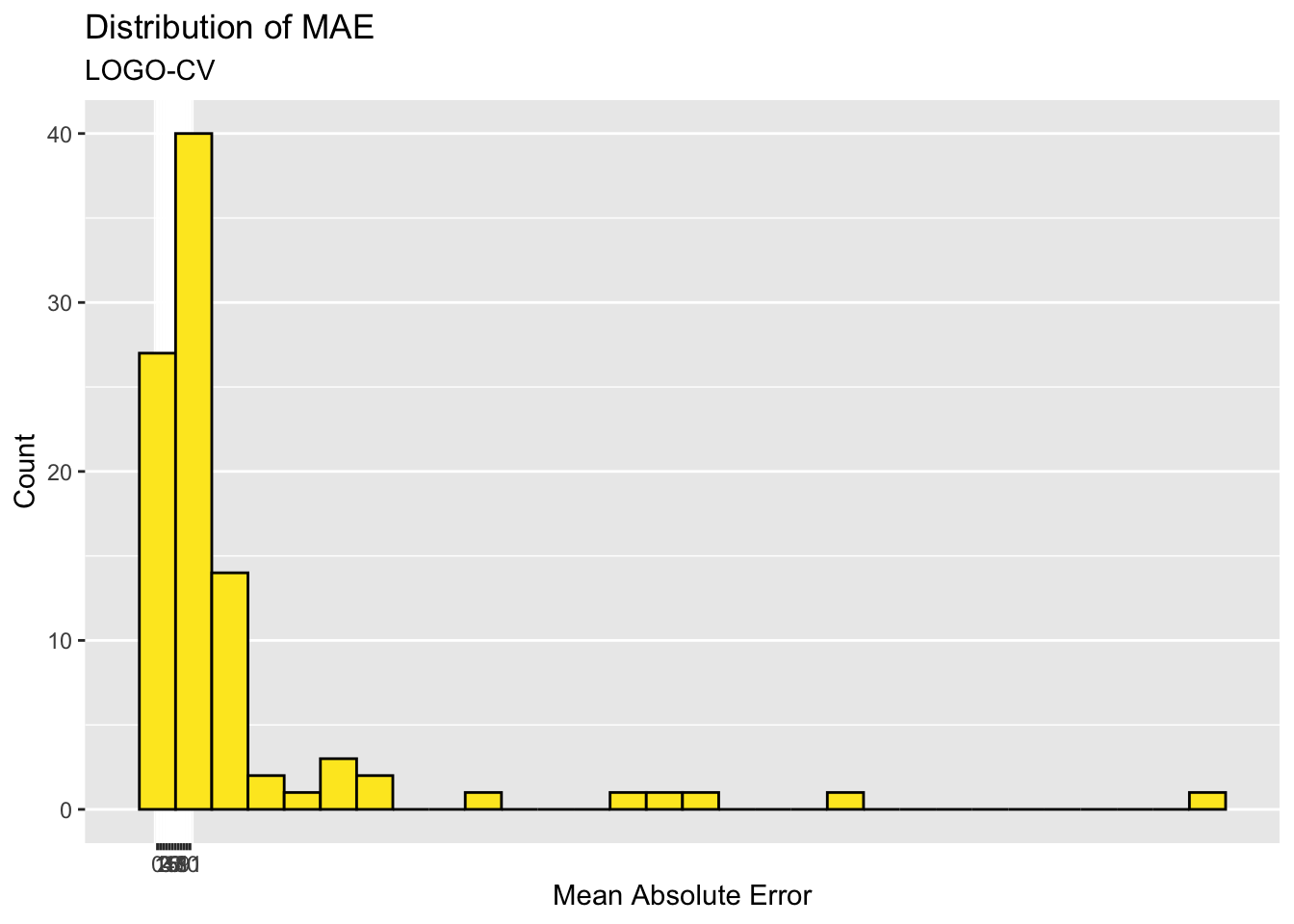
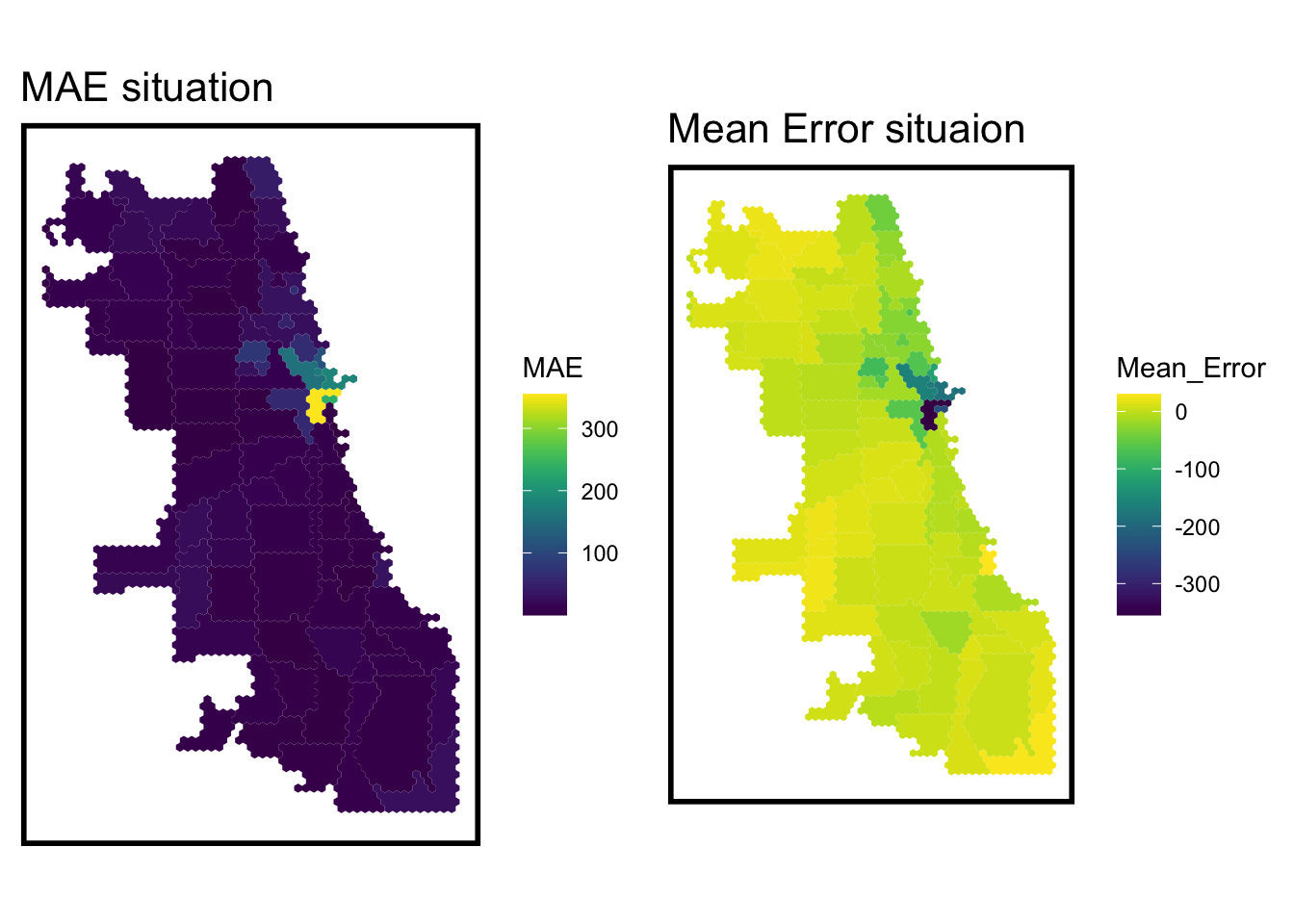
After the analysis above, we select these variable as the model’s independent variables and use cross validation to get the optimal model. And the distribution of Mean Absolute Error (MAE) shows that the main district in the city is well predicted.
When we visualize the geospatial situation of error, we can find that the east part, close to the River North, have a higher error, which represents the prediction in this area should be taken into consideration about inaccuracy.
error_by_reg_and_fold %>%st_drop_geometry() %>%summarise(MAE =mean(MAE),SD_MAE =mean(SD_MAE)) %>%kbl(col.name=c('Mean Absolute Error','Sd of Mean Absolute Error')) %>%kable_classic()
Mean Absolute Error
Sd of Mean Absolute Error
26.86986
52.2145
Race Model Comparison
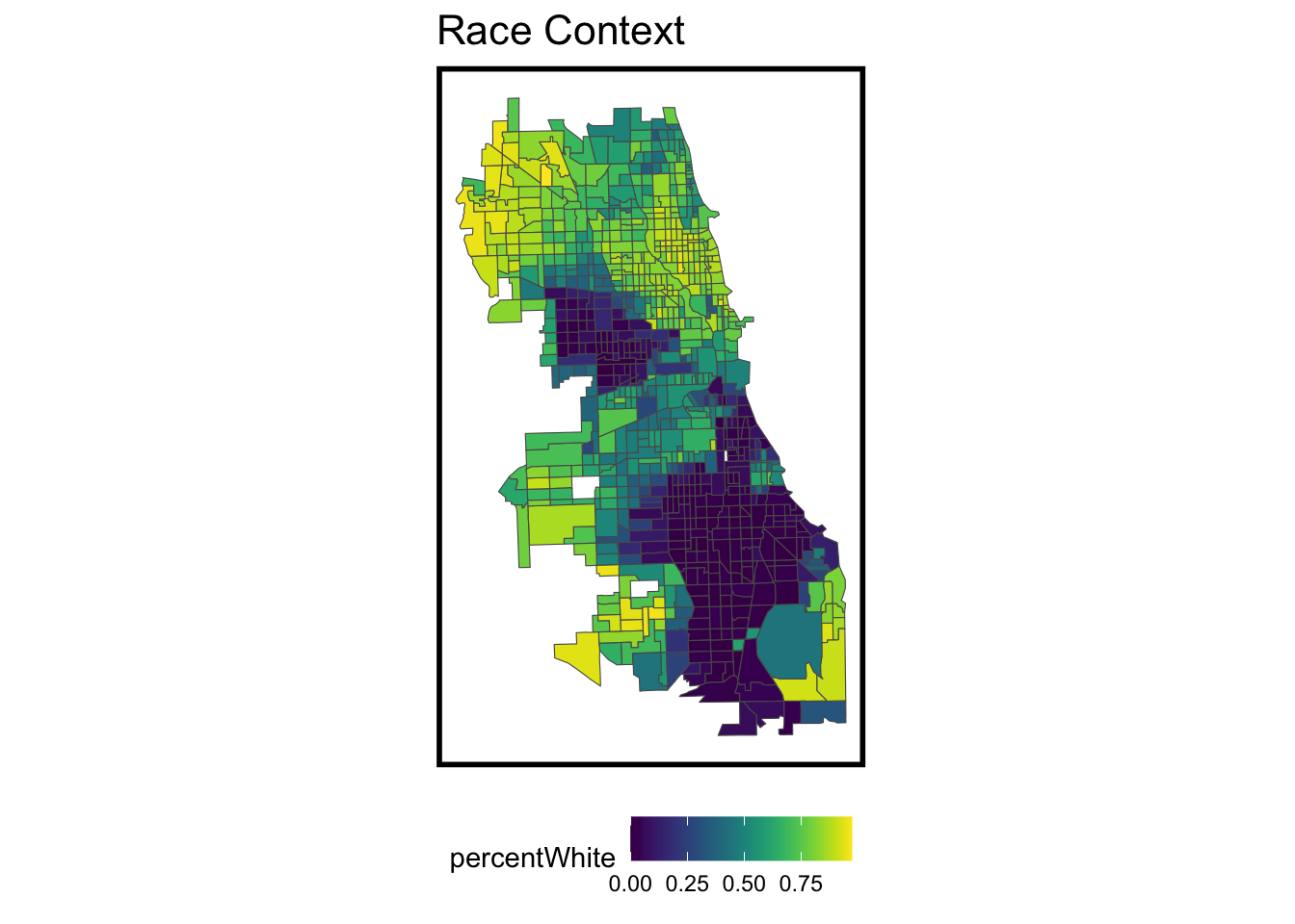
Also, we want to figure out if race variable would play an important role in the count of theft. we use the percentage of white as the variable. We can find that the north part have a higher percentage of white, compared to the south part.
When we compared the basic model and a new one adding the percent of white, we can find that the basic model have a both lower MAE and standard deviation of MAE. The result represent MAE made by the basic model are relatively consistent and close to the mean error, and the reuslt of this model is more convincing.
Code
tt_error <-rbind(mutate(error_by_reg_and_fold,Legend='Spatial'),mutate(error_by_race,Legend ='Race'))tt_error_smry<- tt_error %>%st_drop_geometry() %>%group_by(Legend)%>%summarise(MAE =mean(MAE),SD_MAE =mean(SD_MAE))kable(tt_error_smry, caption ="Error Comparison of Race and Spatial Feature", format ="html")
Error Comparison of Race and Spatial Feature
Legend
MAE
SD_MAE
Race
27.34969
52.56105
Spatial
26.86986
52.21450
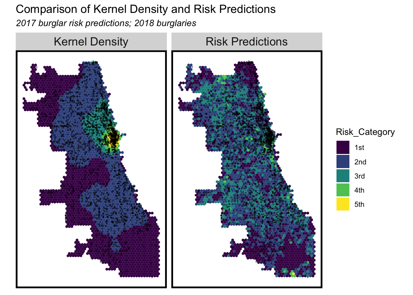
Kernel Density Comparison
map of comparison of Kernel Density and Risk Prediction
We also use Kernel Density to estimate the probability density function of number of theft. The Kernel Density has a strong performance in the general trend illustration. We want to figure out if the crime prediction in the model reveals the similar trend as the Density map reveal and the modeling based on Kernel Density of crime.
When We compared the level of risk based on the number of theft resulted from Kernel Density and model relying on the spatial feature, we can obviously find that the prediction based on Kernel Density show the Circular distribution of risk degree, centering the east part where have high theft frequency.
The risk prediction based on the spatial feature reveals a more decentralized distribution with the east part as the peak risk degree. the Model shows highlights the potential higher risk degree in the noth and middle-south part, compared to the Kernel Density one.
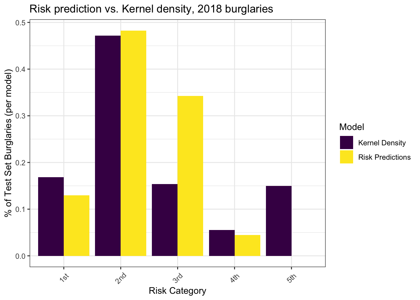
The bar plot compare the percentage of different risk degree of the model prediction and Kernel Density. We can find that with slightly lower percentage of the most risk region than Kernel Density, The risk prediction have a relatively higher percentage in the third degree of risk region. The result reveals that the model indicates Chicago have more places is more dangerous, which seems be away from the place with high theft frequency.
Code
rbind(burg_KDE_sf, burg_risk_sf) %>%st_drop_geometry() %>%na.omit() %>%gather(Variable, Value, -label, -Risk_Category) %>%group_by(label, Risk_Category) %>%summarize(countBurglaries =sum(Value)) %>%ungroup() %>%group_by(label) %>%mutate(Pcnt_of_test_set_crimes = countBurglaries /sum(countBurglaries)) %>%ggplot(aes(Risk_Category,Pcnt_of_test_set_crimes)) +geom_bar(aes(fill=label), position="dodge", stat="identity") +scale_fill_viridis(discrete =TRUE, name ="Model") +labs(title ="Risk prediction vs. Kernel density, 2018 burglaries",y ="% of Test Set Burglaries (per model)",x ="Risk Category") +theme_bw() +theme(axis.text.x =element_text(angle =45, vjust =0.5))
Conclusion
In general, I will recommend to put the model into production. The model has a relative low MAE and standard deviation of MAE, which means that the model is trustworthy in the performance of prediction. Also, the model reveals the invisible risk situation beyond the Kernel Density, especially in Chicago’s north-middle and south-middle part. For another, the model includes several spatial-relevant variables, and have a good interpretation in the variables’ behavior to provide feedback on the improvement of physical environment to improve the situation of theft.
However, the model also has some potential drawbacks to consider. For one thing, the main differentiated place in risk degree also match the place where the variable has spatial autocorrelation, which weaken the convince of the conclusion. For another, the distribution of crime count based on fishnet is also close to skewed normal distribution, which contradicts the basic assumption of OLS, the algorithm used in the model. Therefore, perhaps we need to process the count of theft in another way or find another algorithm to better fit this situation.