In light of recent concerns about the accuracy of Zillow’s housing market predictions, our team has undertaken an effort to enhance house price prediction in Philadelphia. Our primary goal is to contribute to more advanced decision-making for the City of Philadelphia by leveraging machine learning techniques. To achieve improved accuracy and generalizability, we have taken a comprehensive approach. We’ve incorporated various indicators across different fields to ensure that our predictions align more closely with real-world conditions. By doing so, we aim to provide a more accurate representation of Philadelphia’s housing market, which can be valuable for both current decision-making and future planning. This report serves as a detailed account of our approach and methods. It emphasizes the significance of understanding the local context and the seamless integration of this knowledge with pre-existing data. Our overarching objective is to provide a richer context and a more precise understanding of Philadelphia’s housing landscape, fostering informed decision-making for the present and future.
Code
data <-st_read("https://raw.githubusercontent.com/mafichman/musa_5080_2023/main/Midterm/data/2023/studentData.geojson")variables <-c('objectid','census_tract','parcel_shape','building_code','quality_grade','central_air','depth','exempt_land','exterior_condition','fireplaces','frontage','fuel','garage_spaces','garage_type','general_construction','interior_condition','number_of_bathrooms','number_of_bedrooms','number_of_rooms','number_stories','off_street_open','sale_price','year_built','toPredict')f_df <- data[, variables]
Data Clean
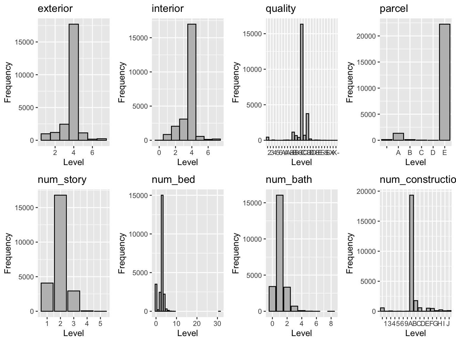
To make the data available for modeling, we make the data clean process. This step includes the initial data exploration, outlier and N/A value handling and the join with other relevant dataset. ## Data Exploration First, we make an exploration for the variables that describe the situation of house. The frequency of each variable basically show the trend of normal distribution, and the situation prove support for the assumption of the regression model we choose later.
Code
ex_his <-ggplot(f_df, aes(x = exterior_condition)) +geom_histogram(binwidth =1, fill ="grey", color ="black") +labs(title ="exterior", x ="Level", y ="Frequency")in_his <-ggplot(f_df, aes(x = interior_condition)) +geom_histogram(binwidth =1, fill ="grey", color ="black") +labs(title ="interior", x ="Level", y ="Frequency")qua_his <-ggplot(f_df, aes(x = quality_grade)) +geom_histogram(stat='count',fill ="grey", color ="black") +labs(title ="quality", x ="Level", y ="Frequency")par_his <-ggplot(f_df, aes(x = parcel_shape)) +geom_histogram(stat='count',fill ="grey", color ="black") +labs(title ="parcel", x ="Level", y ="Frequency")nos_his <-ggplot(f_df, aes(x = number_stories)) +geom_histogram(stat='count',fill ="grey", color ="black") +labs(title ="num_story", x ="Level", y ="Frequency")nobed_his <-ggplot(f_df, aes(x = number_of_bedrooms)) +geom_histogram(stat='count',fill ="grey", color ="black") +labs(title ="num_bed", x ="Level", y ="Frequency")nobath_his <-ggplot(f_df, aes(x = number_of_bathrooms)) +geom_histogram(stat='count',fill ="grey", color ="black") +labs(title ="num_bath", x ="Level", y ="Frequency")gencon_his <-ggplot(f_df, aes(x = general_construction)) +geom_histogram(stat='count',fill ="grey", color ="black") +labs(title ="num_construction", x ="Level", y ="Frequency")grid.arrange(ex_his, in_his, qua_his, par_his, nos_his,nobed_his, nobath_his,gencon_his, ncol =4)
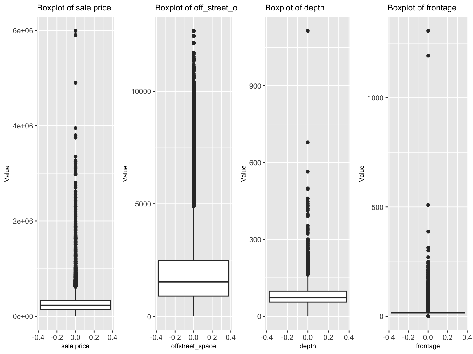
And when we focus on the distribution of sale price and other variables, we find that the data has many outlier with much larger value. To decrease the effect of outlier to the model performance, we make the assumption that the outlier comes from the record mistake, and set the maximum limitation for these outliers. Also, due to some varibles lack large amounts of data (we define the large amount as more than 75% lack), we choose to ignore these variables to guarantee objectivity as far as possible.
In order to develop an enhanced understanding on the housing market, we acquired data that looks beyond the house itself, we gathered data on the external characteristics including the houses proximity to public facilities like urban corridors, private schools, green space. We also examined the economic and racial demographics of the geogrhic area each home is located in.
Census Data
The first source used was from the U.S Census Bureau - specifically the American Community Survey (ACS) dataset - we used data from the 2021 five year ACS survey, which is the most recent ACS five year survey data available.
Code
tracts21 <-get_acs(geography ="tract",variables =c("B01001_001E", # ACS total Pop estimate'B02001_002E', # Estimate!!Total:!!White alone'B02001_003E', # Estimate!!Total:!!Black or African American alone'B02001_005E', # Estimate!!Total:!!Asian alone'B19013A_001E',# Median household income White alone'B19013B_001E',# Median household income Black alone'B19013D_001E',# Median household income Asian alone'B19013_001E', # Median household income 'B01002_001E', # Median Age by Sex "B25002_001E", # Estimate of total housing units"B25002_003E", # Number of vacant housing units"B06009_006E", # Total graduate or professional degree"B15001_050E","B15001_009E","B25058_001E","B06012_002E",'B25105_001E', # Median monthly housing costs 'B25037_001E', # Median year structure built --!!Total'B10058_002E', # Total:!!In labor force'B10058_007E', # Not in labor force'B08141_017E', # Public transportation:!!No vehicle available'B08141_018E', # Public transportation:!!1 vehicle available 'B09002_002E', # OWN CHILDREN UNDER 18 YEARS married family'B09002_015E', # Female householder'B14001_004E'), # Enrolled in kindergarten year=2021, state=42,county=101, geometry=TRUE, output ="wide") %>%st_transform('ESRI:102728') %>%rename(TotalPop = B01001_001E, White = B02001_002E,Black = B02001_003E,Asian = B02001_005E,MedHHInc_White = B19013A_001E,MedHHInc_Black = B19013B_001E,MedHHInc_Asian = B19013D_001E,MedHHInc = B19013_001E,Median_Age_bysex = B01002_001E,Total_Housing_Units = B25002_001E,Vacant_Housing_Units = B25002_003E,Total_Graduate_Prof_Degree = B06009_006E,FemaleBachelors = B15001_050E, MaleBachelors = B15001_009E,MedRent = B25058_001E,TotalPoverty = B06012_002E,Med_mon_hscst = B25105_001E,Med_built_year = B25037_001E,Lab_force = B10058_002E,no_lav_force = B10058_007E,no_pub_trans = B08141_017E,one_pub_trans = B08141_018E,own_child = B09002_002E,own_child_fe = B09002_015E,enroll_kinder = B14001_004E)
Getting data from the 2017-2021 5-year ACS
Downloading feature geometry from the Census website. To cache shapefiles for use in future sessions, set `options(tigris_use_cache = TRUE)`.
OpenData Philly is an open source website that provides a catalog of free data, officially sponsored by the City of Philadelphia. The data provided by the city and other organizations allows us to collect a wide variety of information we can utilize to categorize, describe, and develop a profile for key geographic characteristics which might impact price. And we use the following dataset as our potential variable:
Commercial Corridors – dataset record the location of commercial corridors in Philadelphia.
School – dataset the record the location of school.
City Facilities – dataset record the different type of ameneties.
Homes located in proximity to reputable educational institutions, particularly private schools, often enjoy increased desirability and can fetch higher prices in the real estate market. As a result, we assess the presence of private schools within a 0.25-mile radius of each house. This distance allows for convenient commuting for students and parents while providing access to a variety of educational activities and resources.
Code
School <- School %>% dplyr::select(OBJECTID,GRADE_LEVEL,TYPE_SPECIFIC)School_Private <- School %>%filter(TYPE_SPECIFIC =="PRIVATE") %>%distinct() %>% dplyr::select(geometry)
The proximity to commercial corridors can be a significant factor in attracting more residents to move in. This proximity offers residents the convenience of having grocery stores, restaurants, shops, and other amenities nearby. Additionally, it enhances walkability and fosters more economic activity, contributing to a livelier neighborhood. Therefore, we calculate the distance between each house and the nearest commercial corridor. However, there might also be potential risks of noise, traffic, and crimes, which may influence people’s decision-making process.
Crime is often a crucial neighborhood indicator. Homebuyers frequently prefer properties situated in neighborhoods with lower crime rates, as it ensures a safer and more desirable living environment. By calculating crime counts within different buffer distances of 0.25 miles and 0.125 miles from each house, we aim to account for the potential influence of varying crime ranges on home values. Then, we utilize a k-nearest neighbor approach to provide an additional perspective on the relationship between crime and home values, which calculates the distance between each house and the nearest crime incidents, considering multiple nearest neighbors (k) ranging from 1 to 5. This helps us understand how different levels of crime proximity might affect home values.
## Nearest Neighbor Featurehh_tract <- hh_tract %>%mutate(crime_nn1 =nn_function(st_coordinates(hh_tract), st_coordinates(Crime), k =1),crime_nn2 =nn_function(st_coordinates(hh_tract), st_coordinates(Crime), k =2), crime_nn3 =nn_function(st_coordinates(hh_tract), st_coordinates(Crime), k =3), crime_nn4 =nn_function(st_coordinates(hh_tract), st_coordinates(Crime), k =4), crime_nn5 =nn_function(st_coordinates(hh_tract), st_coordinates(Crime), k =5))
City Facilities: Park and recreation, Library, Museum and zoo
City facilities such as parks and recreation areas, libraries, museums, and zoos are essential amenities that can significantly influence the attractiveness and livability of a neighborhood. Homebuyers often value proximity to these facilities, as they contribute to a higher quality of life and a sense of community. So we further calculate the proximity of each house to these selected facilities with a buffer of 0.25 miles, which is a reasonable walking distance for residents to access these amenities. Then, we use knn approach again to assess how proximity to these city facilities may affect home values.
## Nearest Neighbor Featurehh_tract <- hh_tract %>%mutate(facilities_nn1 =nn_function(st_coordinates(hh_tract), st_coordinates(CityFacilities), k =1),facilities_nn2 =nn_function(st_coordinates(hh_tract), st_coordinates(CityFacilities), k =2), facilities_nn3 =nn_function(st_coordinates(hh_tract), st_coordinates(CityFacilities), k =3), facilities_nn4 =nn_function(st_coordinates(hh_tract), st_coordinates(CityFacilities), k =4), facilities_nn5 =nn_function(st_coordinates(hh_tract), st_coordinates(CityFacilities), k =5))
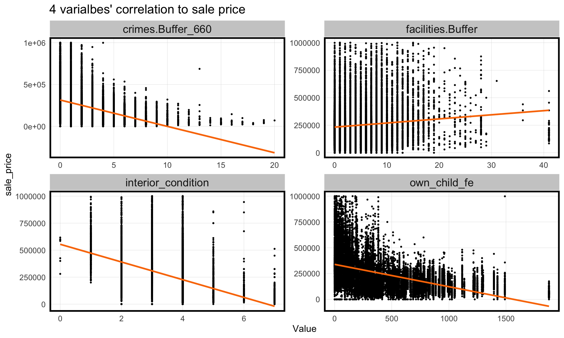
##Home Price Scatterplots The four graphs below represent four key dependent variables that broadly cover each aspect of a neighborhood in order to determine house prices. Interior condition represent directly the quality of house, relating highly to the house cost. As forthe number of crime in 0.25 miles surrounding house, representing the degree of security. And the number of ameneties like park represents the accessibility to the public service. Last but not least, the number of female who owned child in the tract where house locates indicates the potential demand for school in the area.
Code
## Home Features corst_drop_geometry(hh_tract) %>% dplyr::select(sale_price, own_child_fe, crimes.Buffer_660, facilities.Buffer,interior_condition) %>%filter(sale_price <=1000000) %>%gather(Variable, Value, -sale_price) %>%ggplot(aes(Value, sale_price)) +geom_point(size = .5) +geom_smooth(method ="lm", se=F, colour ="#FA7800") +facet_wrap(~Variable, ncol =2, scales ="free") +labs(title ="4 varialbes' correlation to sale price") +plotTheme()
`geom_smooth()` using formula = 'y ~ x'
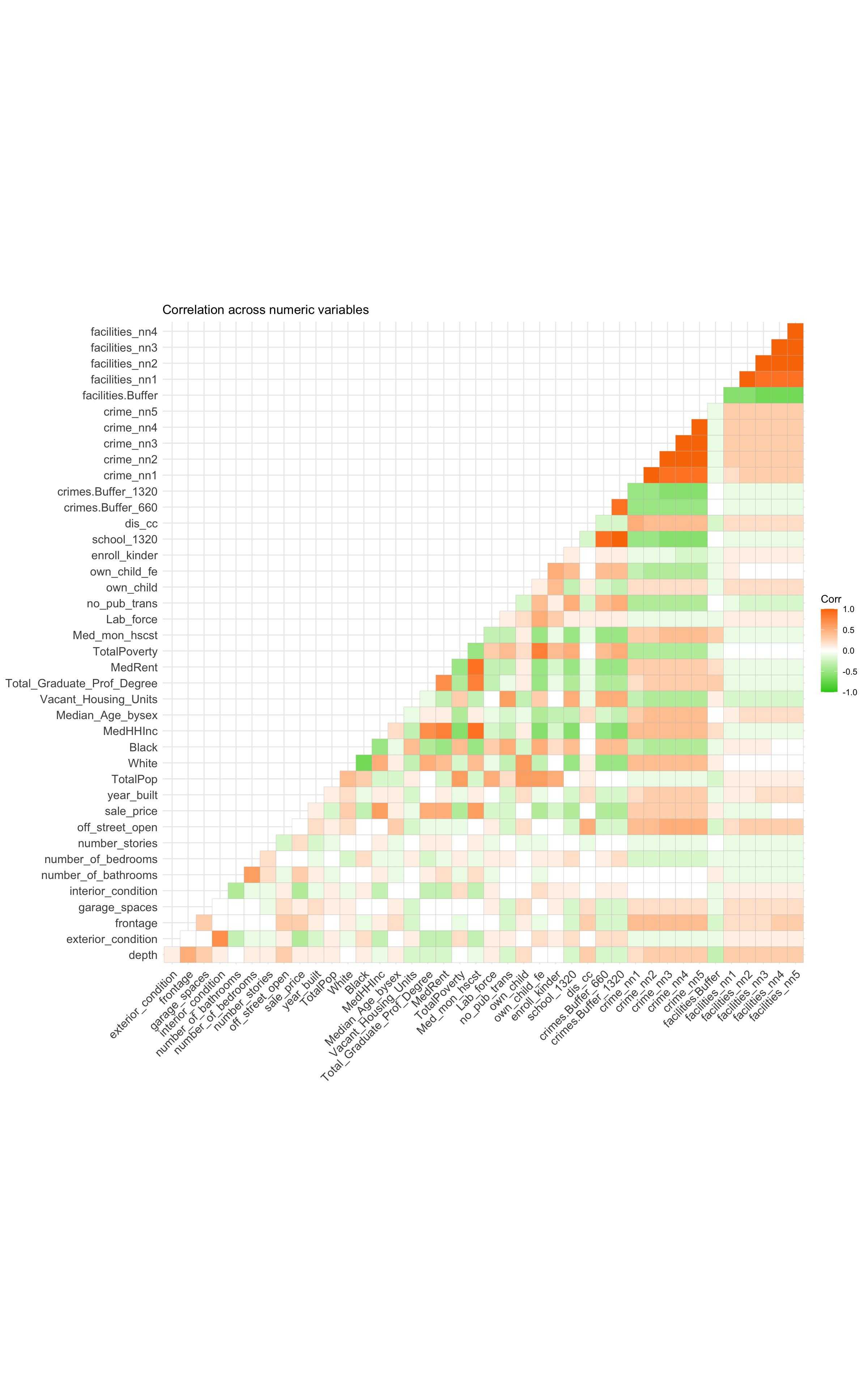
##Correlation Test from Correlation Matrix A correlation matrix compares factors against one another to see how related they are at determining the others value. Each box presented can indicate whether there is a correlation (directly or inverse) or little relationship between them. We are able to see strong correlation between many factors. From the correlation matrix, we can find that the number of school, the number of crime in 400 meter range, the number of female owned children in the tract, the total poverty situation where the house located have a positive correlation to the house price; Median household income, median rent, median monthly house cost have a negative correlation to the house price. These high correlation performance will function as an important basis for the variable selection in the model for predicting house price.
The model used for predicting house price contains variable including varibles in the table below. In detail, we use internal characteristics (interior_condition,number of bathrooms, number of bedrooms), public services (number of school in 0.5 miles, number of amenities in 0.5 miles, distance to commercial corridor) and social economic spatial structure (number of crime in 0.25 miles, poverty situation, public transit accessibility, number of female own children).
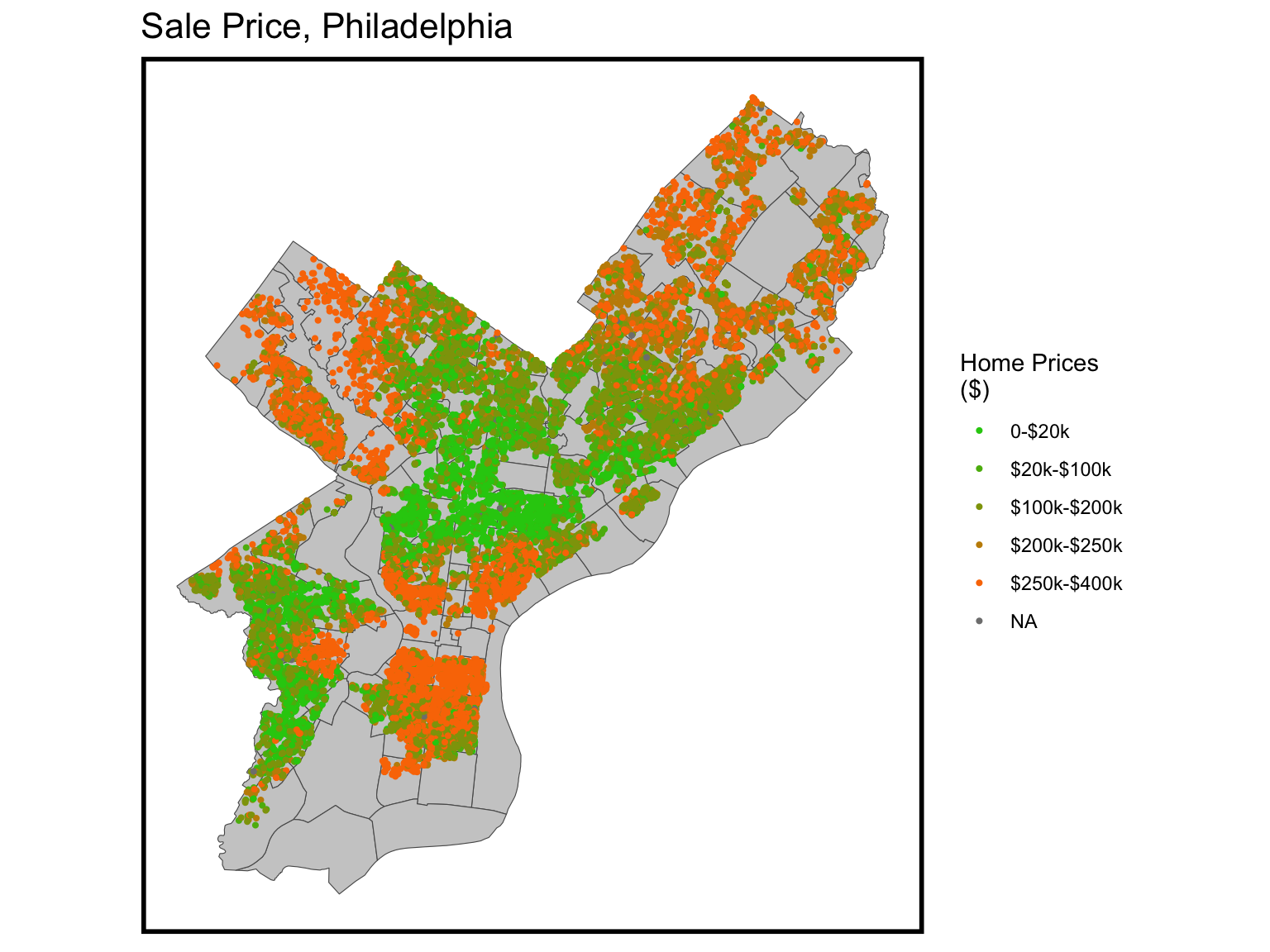
This map explores how home prices change in Philadelphia in 2021. We can see from the map that home prices are higher in the center city and outermost suburbs than in other areas.
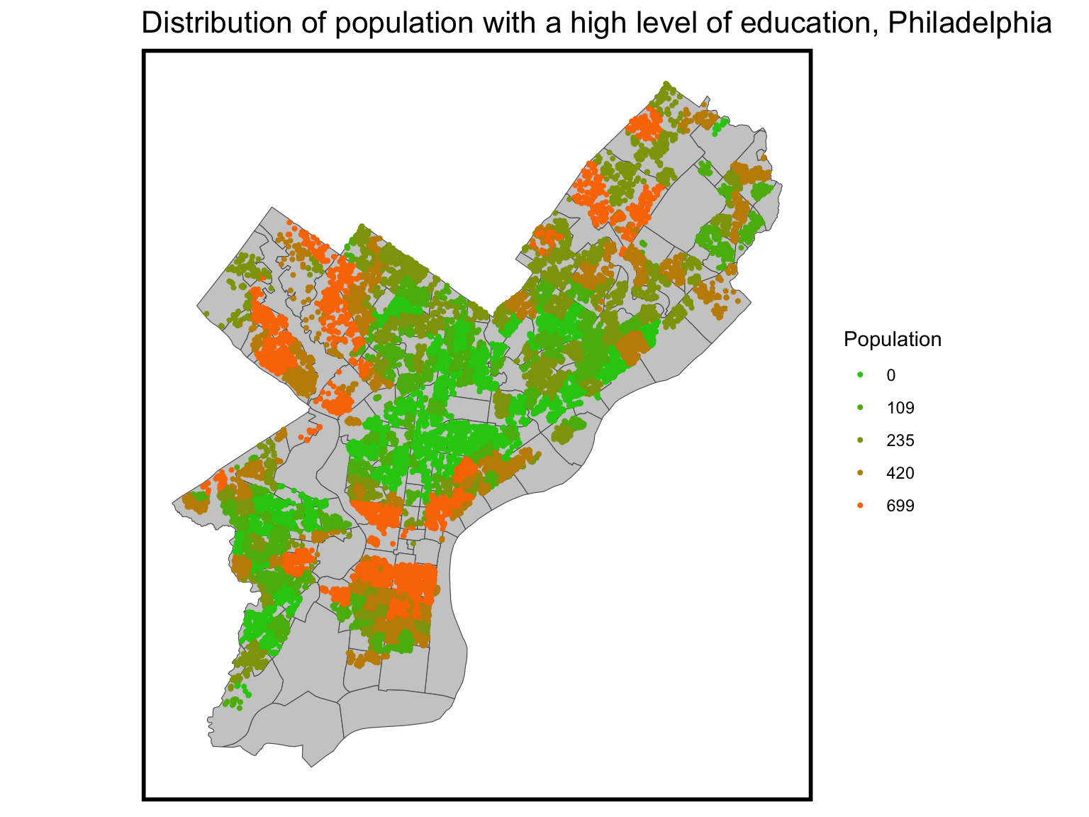
The distribution of individuals with higher education closely mirrors the pattern of home prices. This demographic tends to reside predominantly in the city center or in the suburban areas on the outskirts of the city.
Code
ggplot()+geom_sf(data = nhoods, fill ="grey80") +geom_sf(data=hh_tract,aes(colour =q5(Total_Graduate_Prof_Degree)), show.legend ="point", size = .75) +scale_colour_manual(values = palette5,labels=qBr(hh_tract,"Total_Graduate_Prof_Degree"),name="Population") +labs(title="Distribution of population with a high level of education, Philadelphia") +mapTheme()
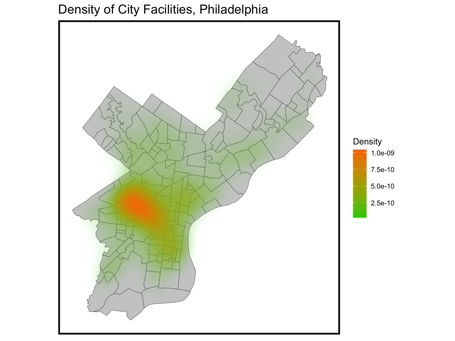
Facilities Density
Regarding facilities, a majority of them are concentrated in university city and the western part of the center city. This clustering is clearly visible and gradually extends outward toward the city’s periphery.
Code
ggplot() +geom_sf(data = nhoods, fill ="grey80") +stat_density2d(data =data.frame(st_coordinates(CityFacilities)), aes(X, Y, fill = ..level.., alpha = ..level..),size =0.01, bins =40, geom ='polygon') +scale_fill_gradient(low ="#25CB10", high ="#FA7800", name ="Density") +scale_alpha(range =c(0.00, 0.35), guide =FALSE) +labs(title ="Density of City Facilities, Philadelphia") +mapTheme()
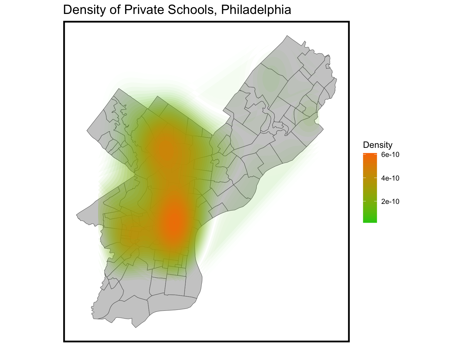
Private School Density
Private schools are concentrated in the center of the city and in the northwestern part of the city. The south-east corner and the south are relatively sparsely distributed.
Code
ggplot() +geom_sf(data = nhoods, fill ="grey80") +stat_density2d(data =data.frame(st_coordinates(School_Private)), aes(X, Y, fill = ..level.., alpha = ..level..),size =0.01, bins =40, geom ='polygon') +scale_fill_gradient(low ="#25CB10", high ="#FA7800", name ="Density") +scale_alpha(range =c(0.00, 0.35), guide =FALSE) +labs(title ="Density of Private Schools, Philadelphia") +mapTheme()
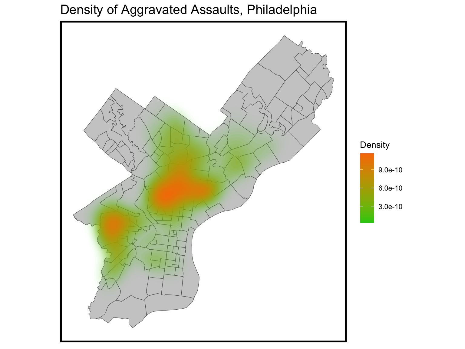
Assault Density
Regarding the concentration of aggravated assaults, there are two distinct areas of concern. One is located to the west of University City, and the other is situated to the north of Center City. In these areas, both property sale prices and educational attainment levels among residents tend to be relatively low.
Code
ggplot() +geom_sf(data = nhoods, fill ="grey80") +stat_density2d(data =data.frame(st_coordinates(Crime)), aes(X, Y, fill = ..level.., alpha = ..level..),size =0.01, bins =40, geom ='polygon') +scale_fill_gradient(low ="#25CB10", high ="#FA7800", name ="Density") +scale_alpha(range =c(0.00, 0.35), guide =FALSE) +labs(title ="Density of Aggravated Assaults, Philadelphia") +mapTheme()
Data Modeling
Table of Results (Training)
We have decided on a filtered list of key dependent variables to use to predict home values. Those factors being the following: interior condition, number of bathrooms, number of bedrooms, number of school in 0.5 miles, number of crime in 0.25 miles, number of female who own child in the tract, total poverty number, number of ameneties like parks in 0.5 miles, distance to commercial corridor, and the number of no public transportation access in the tract.
Code
inTrain <-createDataPartition(y =paste(hh_tract$name), p = .60, list =FALSE)p.training <- hh_tract[inTrain,] p.test <- hh_tract[-inTrain,] indpdt_var <-c('sale_price','interior_condition','number_of_bathrooms','number_of_bedrooms','school_1320','crimes.Buffer_660','own_child_fe','TotalPoverty','facilities.Buffer','dis_cc','no_pub_trans')reg.training <-lm(sale_price ~ ., data =as.data.frame(p.training) %>% dplyr::select(indpdt_var))summary(reg.training)
n this phase of the process, we are currently training the model to predict housing prices. We have supplied the model with data points, each accompanied by its respective set of attributes linked to the sale price. The model learns the relationship between these attributes and sale prices, subsequently generating its own set of predicted values when presented with new data. The table presented below demonstrates the disparities between the model’s predictions and the actual values, quantified as their absolute errors. Given that we are dealing with substantial-value assets, such as housing, the differences between the model’s predictions and the actual values can be substantial. Additionally, it is equally crucial to assess these discrepancies in terms of percentage values to gauge the relative magnitude of the disparities.
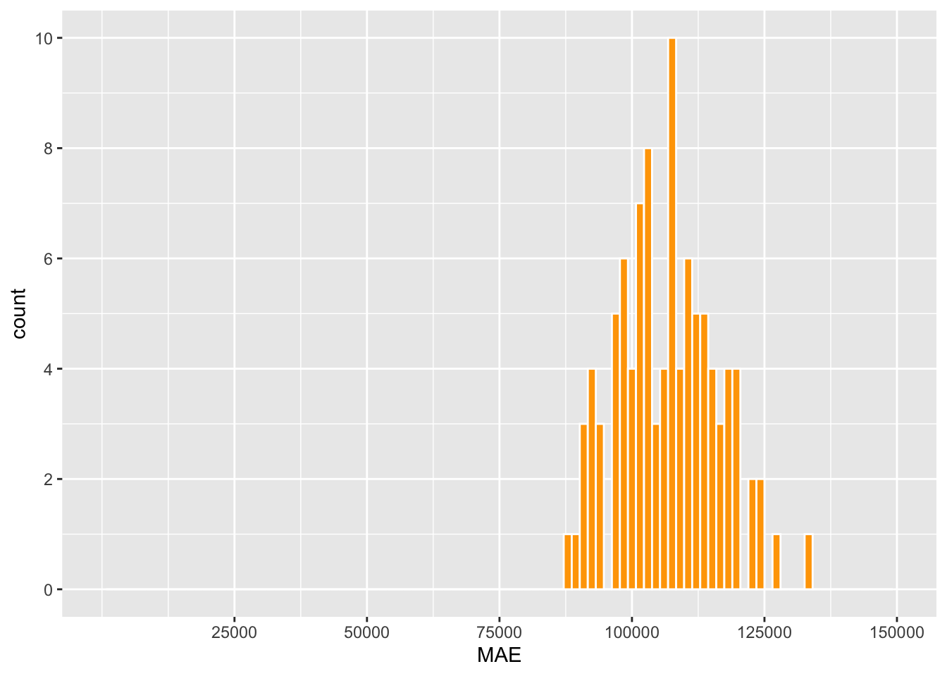
Up to this point, our analysis has been primarily centered on a single training and test dataset. To evaluate the model’s capacity to generalize to new data, it’s essential to employ a repeated modeling approach involving multiple runs with varying training datasets. This methodology is known as K-Fold Cross Validation, and it entails partitioning the data into 100 distinct training datasets. Each training dataset omits a different set of home sales data points, which are subsequently utilized to assess the model’s error. The following scatter plot illustrates a histogram representing the Mean Absolute Error (MAE) across all 100 analyses. The MAE ranges from $80,000 to $130,000. The distribution of these MAEs closely approximates a normal distribution, with a prominent peak around $100,000. Despite a degree of inaccuracy, this observation suggests that the model exhibits generalizability and consistently yields results when confronted with various training data.
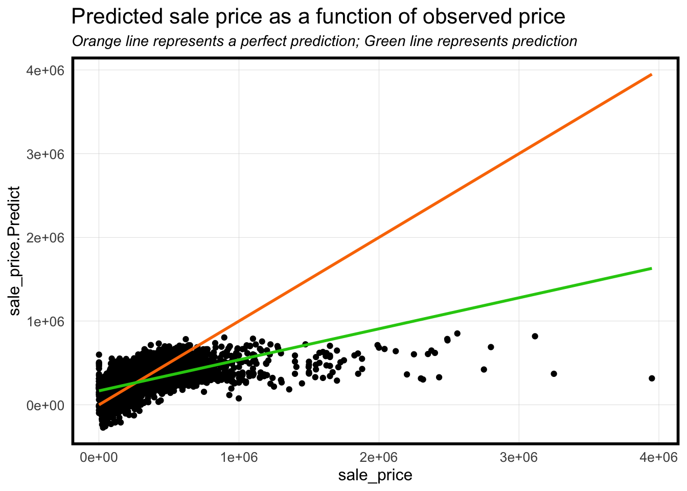
The graph presented below illustrates the disparity between our predictive model and the concept of “perfect predictions,” where 100% accuracy is attained. Across the majority of clusters, our model aligns closely with the line of perfection, indicating its overall accuracy. However, when dealing with a smaller number of high-value homes, especially those exceeding $2 million, the model exhibits a tendency to undervalue their worth. Another noteworthy limitation of the model is the presence of negative results. Multiple data points fall below the (0,0) point, indicating that the model predicts a negative value for certain homes, despite their actual sales prices being positive integers. Strikingly, the model appears to slightly overestimate the values of these homes, as evidenced by the model prediction line (in green) surpassing the line of perfection. This observation could serve as an indicator of properties that require significant investment in maintenance or are in such poor condition that the cost of repairs surpasses the purchase price, categorizing them as potential “fixer-upper” candidates.
Code
p.test %>% dplyr::select(sale_price.Predict, sale_price) %>%ggplot(aes(sale_price, sale_price.Predict)) +geom_point() +stat_smooth(aes(sale_price, sale_price), method ="lm", se =FALSE, size =1, colour="#FA7800") +stat_smooth(aes(sale_price, sale_price.Predict), method ="lm", se =FALSE, size =1, colour="#25CB10") +labs(title="Predicted sale price as a function of observed price",subtitle="Orange line represents a perfect prediction; Green line represents prediction") +plotTheme()
Spatial Pattern of Errors
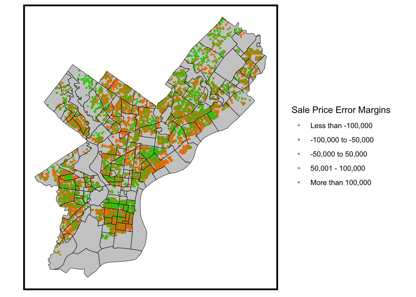
Map of Residual Errors
The map presented below provides a visual representation of the absolute margin of error associated with each sales price prediction. The majority of errors fall within the range of plus or minus $50,000. However, it’s important to note that there are distinct areas with more substantial errors, particularly in the northwest, where higher-value homes are located. This underscores the model’s consistent tendency to underestimate the values of these high-end properties.
Code
p.test <- p.test %>%mutate(spErrorClass =cut(sale_price.Error, breaks =c(min(p.test$sale_price.Error, na.rm=TRUE)-1, -100000, -50000, 50000, 100000, max(p.test$sale_price.Error, na.rm=TRUE))))ggplot()+geom_sf(data=nhoods,fill='grey80',color='transparent')+geom_sf(data=p.test, size=0.5,aes(colour = spErrorClass))+geom_sf(data=nhoods,fill='transparent',color='black')+scale_color_manual(values = palette5,name ="Sale Price Error Margins",na.value ='grey80',labels =c('Less than -100,000', '-100,000 to -50,000', '-50,000 to 50,000', '50,001 - 100,000','More than 100,000'))+mapTheme()
Spatial Lag Analysis
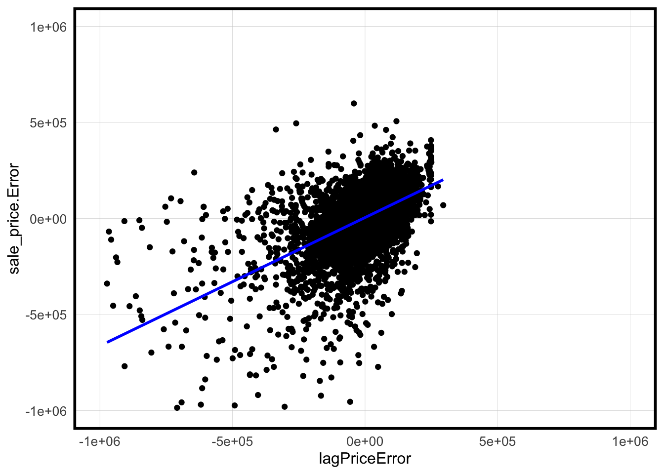
Analyzing the residuals map displayed above, we can observe a pattern of spatial clustering in the residuals. To further investigate this, we assess whether there’s a similarity between our predicted values and the predicted values of nearby homes. To do this, we employ a spatial lag calculation, which involves computing the spatial lag as the weighted sum of values from neighboring locations. The scatter plot below juxtaposes the sales price error for each home in our model against the spatial lag error for sales price, which is calculated based on the average error of the five nearest neighbors. The points in the scatter plot exhibit clustering, signifying that our model generally predicts similar errors for a home and its five nearest neighboring homes. The blue line on the plot represents the regression line, indicating this spatial similarity in error predictions.
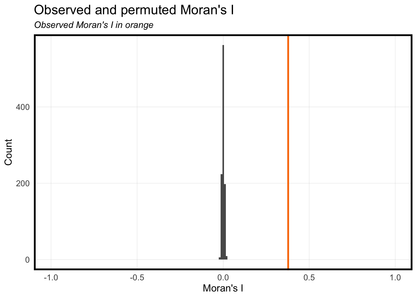
Moran’s I is a measurement in statistics that evaluates the tendency for data points with similar values to occur near one another. Similar to Nearest Neighbor, to statistically prove that houses spatially close to each other would have similar sale prices. This type of measurement helps us identify high and low value clusters (i.e different neighborhoods and their perceived value). In the graph below, you can observe a relatively narrow distribution in gray, which represents the counts of houses and their sale prices used in our regression model. The orange line corresponds to the Moran’s I value, which serves to assess whether there is a correlation between property value and location. The observed Moran’s I stands at approximately 0.4, a statistically significant value indicating a correlated spatial distribution of property values.
Code
moranTest <-moran.mc(p.test$sale_price.Error, spatialWeights.test, nsim =999)ggplot(as.data.frame(moranTest$res[c(1:999)]), aes(moranTest$res[c(1:999)])) +geom_histogram(binwidth =0.01) +geom_vline(aes(xintercept = moranTest$statistic), colour ="#FA7800",size=1) +scale_x_continuous(limits =c(-1, 1)) +labs(title="Observed and permuted Moran's I",subtitle="Observed Moran's I in orange",x="Moran's I",y="Count") +plotTheme()
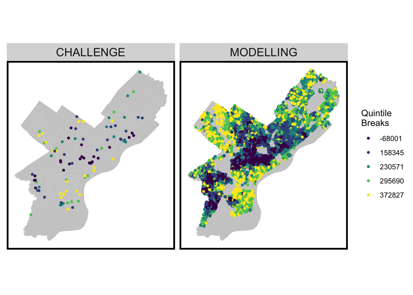
Predicted values for where ‘toPredict’ is both “MODELLING” and “CHALLENGE”.
We aimed to compare our modeling dataset against the “challenge” dataset, which encompasses specific houses for which we needed to make predictions. The modeling map displays the houses we employed to train the model on how to predict various sales prices, even when those houses already had existing sale prices. The model subsequently began predicting values based on this modeling data, and the outcomes are depicted below. For the “challenge” dataset, the model lacked any pre-existing sales prices to reference. As a result, we now observe the predicted sales prices generated by the model for this set of data. Comparing the maps to each other, the challenge houses reflects the modelling sets through what would otherwise be the entire neighborhood. This parallel between the two maps prove that the challenge set is consistent with the predicted house prices used in the model and therefore can reasonably predict home values without the need of any previous sale price.
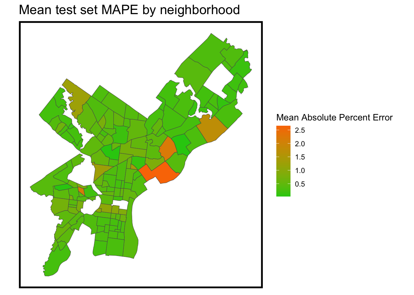
Irrespective of the model’s overall accuracy and its general capability to predict house prices, it’s crucial to recognize its weaknesses on a neighborhood-by-neighborhood basis. By doing so, we can gain insight into which areas the model tends to overestimate or underestimate. A prominent observation from the map is that the model’s most significant errors are concentrated in the lower-income north and east sections of the city. This suggests that the model is less accurate in these less desirable neighborhoods, where its predictions tend to be further from the actual values.
Code
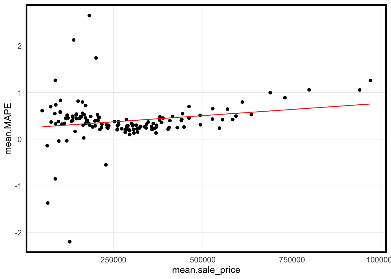
st_drop_geometry(p.test) %>%group_by(Regression, name) %>%summarize(mean.MAPE =abs(mean(sale_price.APE, na.rm = T))) %>%ungroup() %>%left_join(nhoods) %>%st_sf() %>%ggplot() +geom_sf(aes(fill = mean.MAPE)) +scale_fill_gradient(low = palette5[1], high = palette5[5],name ="Mean Absolute Percent Error") +labs(title ="Mean test set MAPE by neighborhood") +mapTheme()
scatterplot plot of MAPE by neighborhood as a function of mean price by neighborhood.
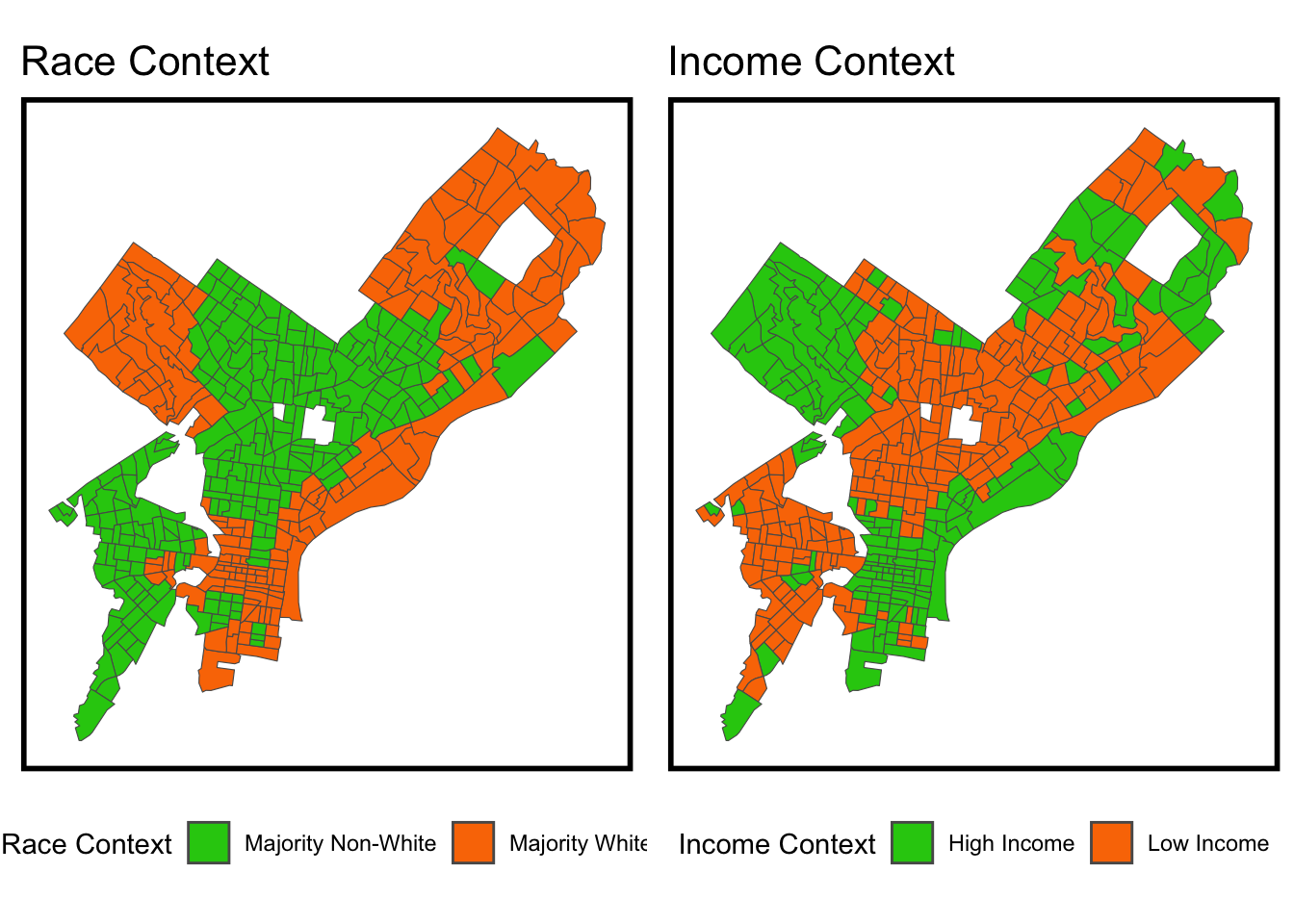
These two maps show the significant income gap between races in Philadelphia. There is an evident parallel between higher income areas and fewer minority populations. There are many reasons historically, politically, and through socioeconomic that create and define these boundaries. But that is also exactly why incorporating race as a factor in the models prior were not recommended. Adding race to a model adds a cascading effect of discrimination that feeds future predictions to assume race is a pre-determined factor that effects house values. Race is only a factor in housing models because of historical systemic racism and discriminatory policies that created parallels between racial and economic disparity.
The accuracy of the model is contingent on specific metrics tailored to the characteristics of Philadelphia. To scale the model for use in other cities, extensive research and data collection would be essential, especially regarding factors like school systems, crime statistics, and other external sources that might differ significantly across regions. While the quantity of data can enhance the accuracy of predictors, the quality of data, particularly data that pinpoints critical variables affecting home prices, is equally crucial for efficient model training. In terms of generalization, the model’s applicability may primarily extend to the Philadelphia region due to its familiarity with the local context and the specific dataset it was trained on. Incorporating data from locations beyond this region would likely lead to inaccuracies because of the varying local contexts and the need for entirely new datasets to capture the specific dynamics of those areas.
Conclusion
Based on our findings, we do not recommend widespread adoption of the model, primarily due to its inaccuracy in extreme situations. It’s apparent that the model’s limitations become most pronounced when dealing with exceptionally high or low house prices. However, our model has shed light on the importance of public services and security in influencing house prices, considering factors such as green space accessibility and distance to corridors. In the pursuit of fostering housing equity in Philadelphia, it is imperative to give due attention to equity in public resources. Nevertheless, we cannot disregard the model’s weakness in predicting areas where house prices are extremely high or low. It may be worthwhile to reconsider our approach when defining and handling “outliers.” Additionally, we should explore other variables that could better capture the features associated with higher or lower housing prices.